VOX · SHIPPED 2018
Everlytic Corporate Branding Update
Overview
Rebuilding a fragmented brand into a cohesive, scalable corporate identity.
I led the team that redesigned Everlytic’s corporate identity — transforming a dated, inconsistent brand into a structured, scalable system spanning logo, colour, typography, iconography, photography, and collateral.
Everlytic is one of South Africa’s leading digital communication platforms, powering email, SMS, and transactional messaging at scale. Following Vox’s acquisition, the brand needed an identity that matched its ambition — and the 2017 system I helped shape still underpins the Everlytic brand today.
The identity system was developed from 2015–2017 and rolled out across the brand in 2018.
A brand rebuilt in 2017 — and still shaping Everlytic today
- Role
- Lead Designer — Corporate Identity
- Timeline
- 2015 – 2017
- Team
- Vox Marketing Everlytic Stakeholders Design Team
- Skills
- Brand Strategy Corporate Identity Logo Design Design Systems Typography Colour Theory Art Direction Print & Digital Collateral
About Everlytic
South Africa’s platform for bulk email, SMS, and transactional messaging.
Everlytic (a trading brand of Prefix Technologies) gives organisations the power to run large-scale, multi-channel communication — email marketing, SMS, and transactional/production messaging — with POPIA-compliant infrastructure built for deliverability.
As the platform matured and its customer base grew across South Africa, its brand needed to project the same reliability, scale, and professionalism the product delivered.
Before the Redesign
A dated, inconsistent identity that no longer matched the product.
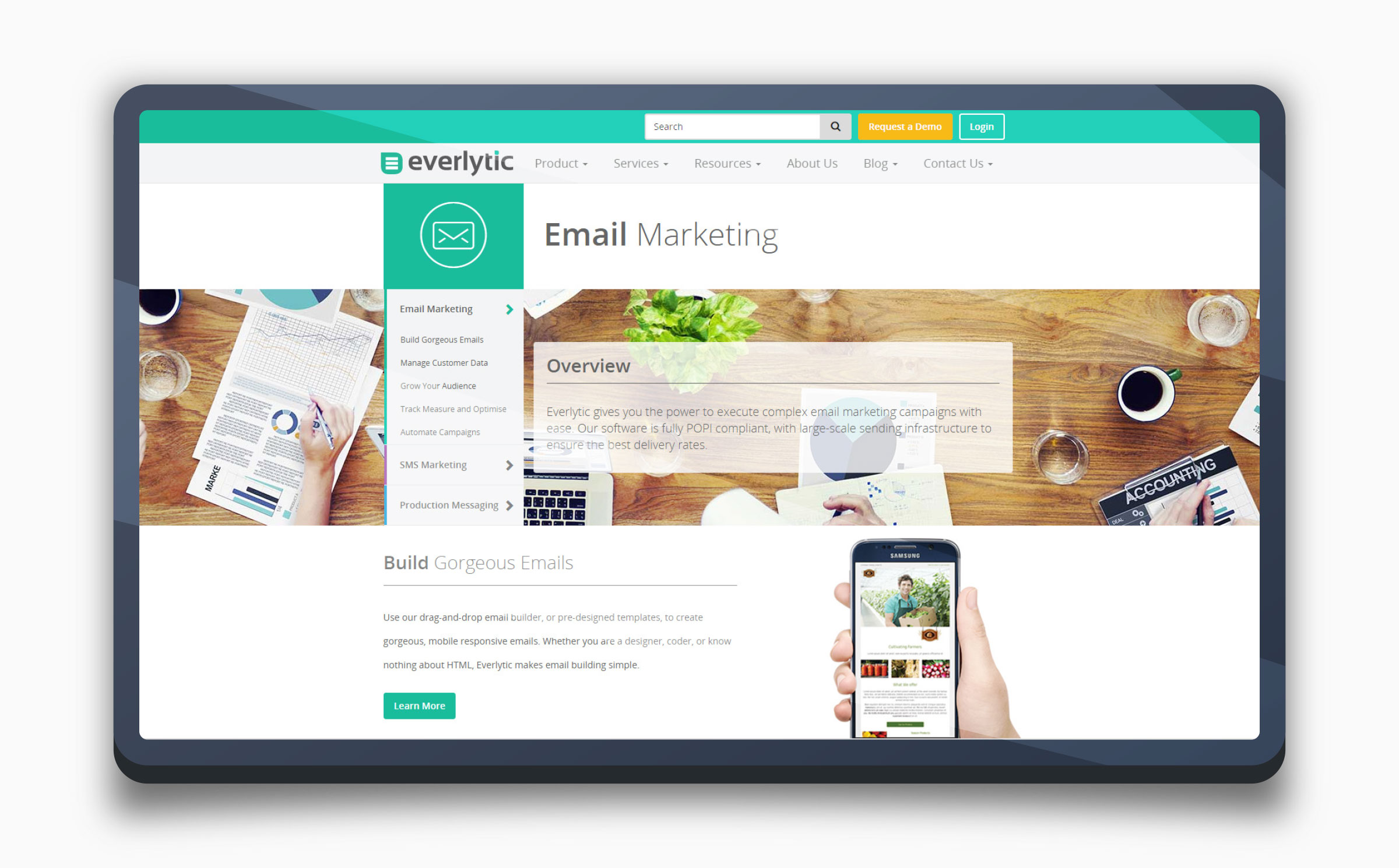
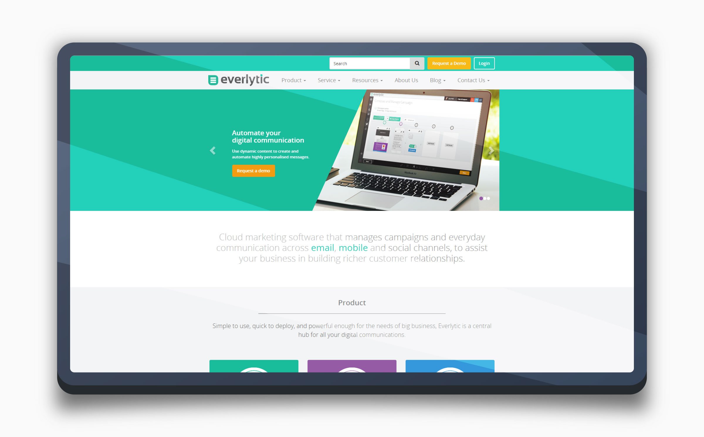
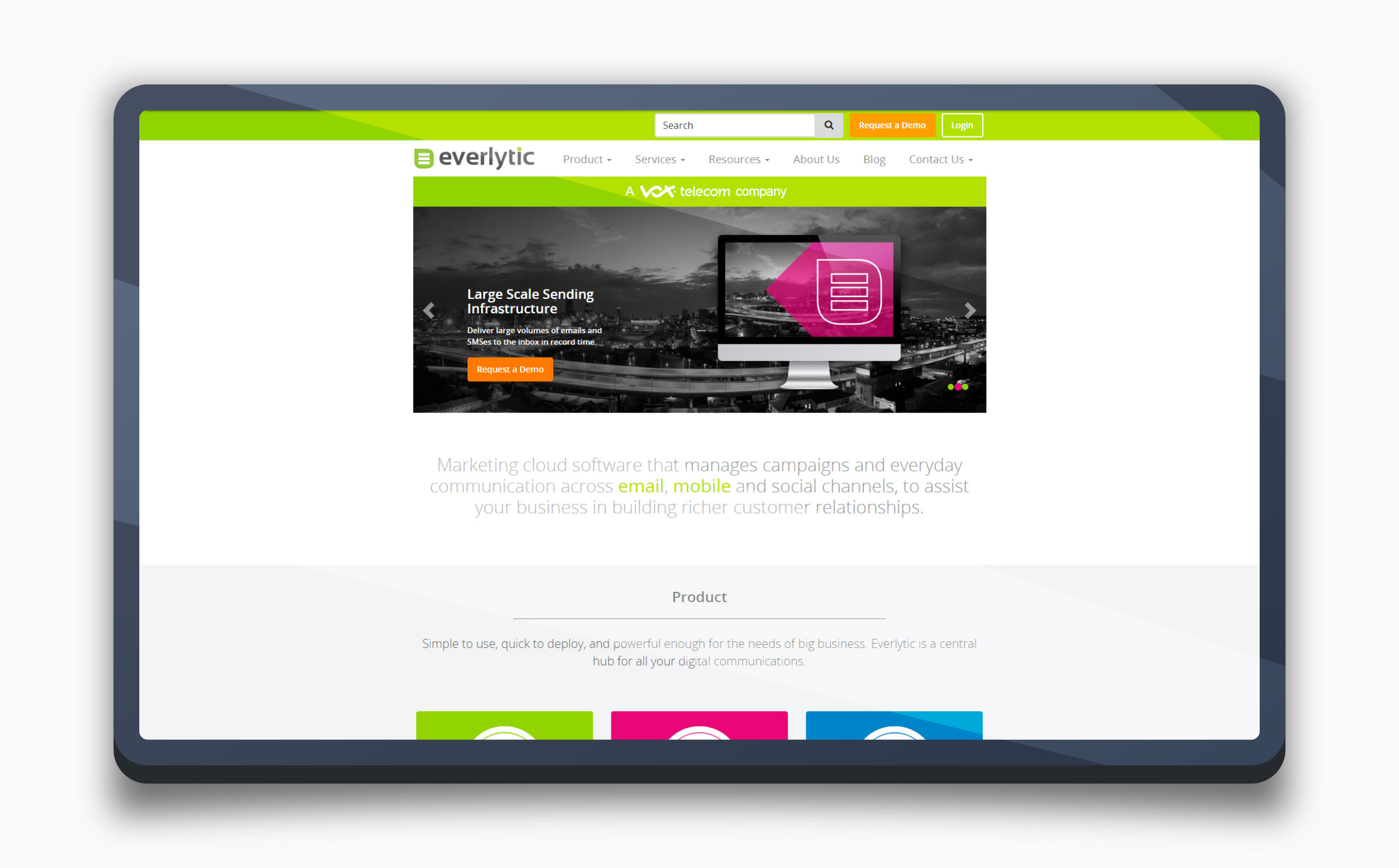
I joined Everlytic’s marketing team as Lead Digital Designer in 2015. My first focus was the website: the brand I inherited was fragmented — a busy interface, generic stock photography, and no unified system tying touchpoints together. Visual treatment drifted across the website, product, and print, weakening recognition and trust.
For a platform positioned as a serious communication partner, the identity undersold the business, and couldn’t scale consistently across a growing range of channels and collateral. Working with a cross-functional team, I began improving the website — an early iteration that started to bring clarity and consistency, and set the direction for the full corporate identity redesign that followed.
A Brand in Transition
A Vox acquisition, and an interim identity to bridge the gap.
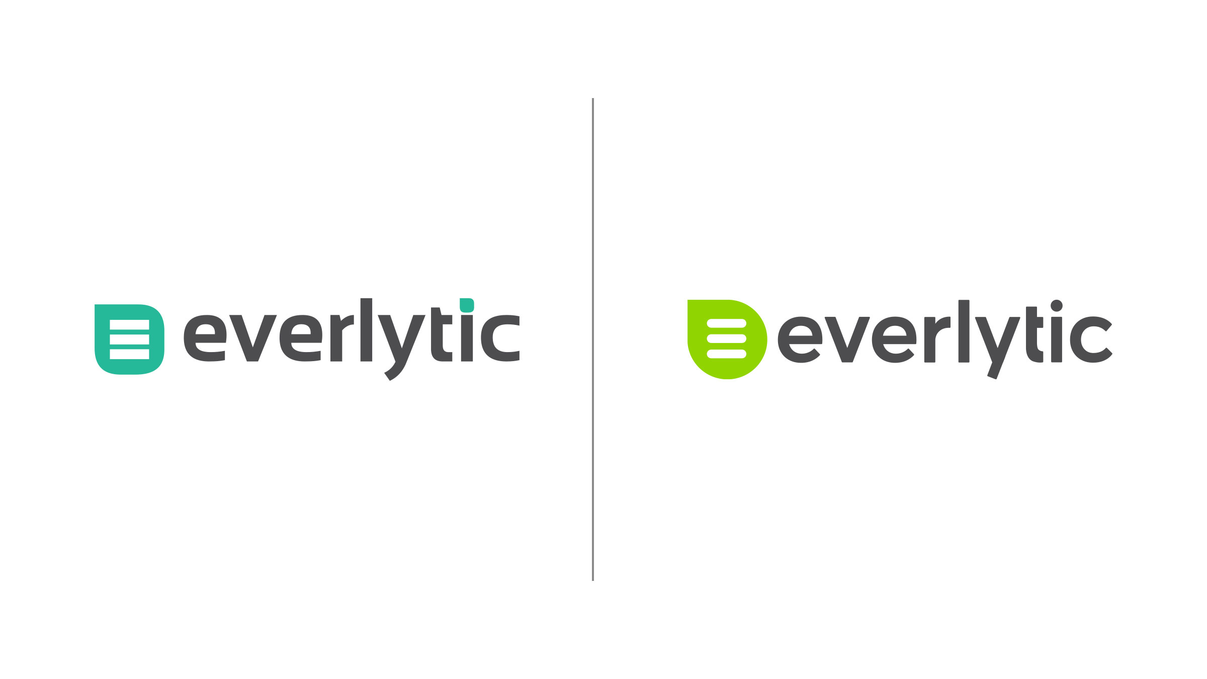
In 2016, Vox acquired Everlytic — a turning point that called for the brand to align with a larger, more established group. As a first step, the Everlytic logo, brand, and website were updated to reflect the Vox brand colour palette — an interim treatment that steadied the identity and signalled the new ownership while a fuller redesign was planned, keeping the brand coherent during the transition.
This set the stage for a comprehensive corporate identity system: not a quick refresh, but a considered rebuild designed to scale.
The Redesign
A complete corporate identity system, built to scale.
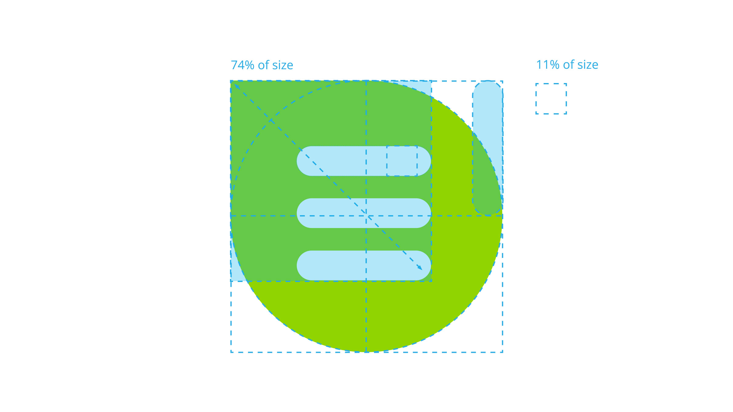
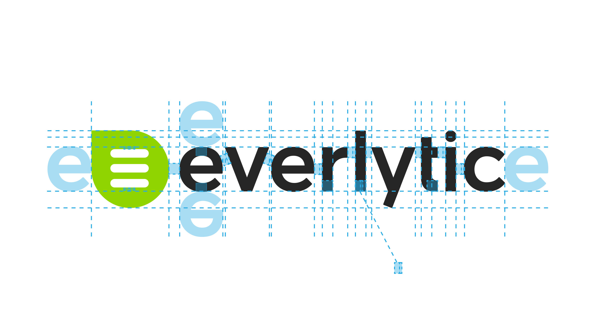
Leading the redesign team, I developed a comprehensive CI system captured in a full style guide. At its heart: a refined green message/speech-bubble mark and the “everlytic” wordmark, built on a construction grid for consistency at any size, with primary, stacked, and alternative logo treatments.
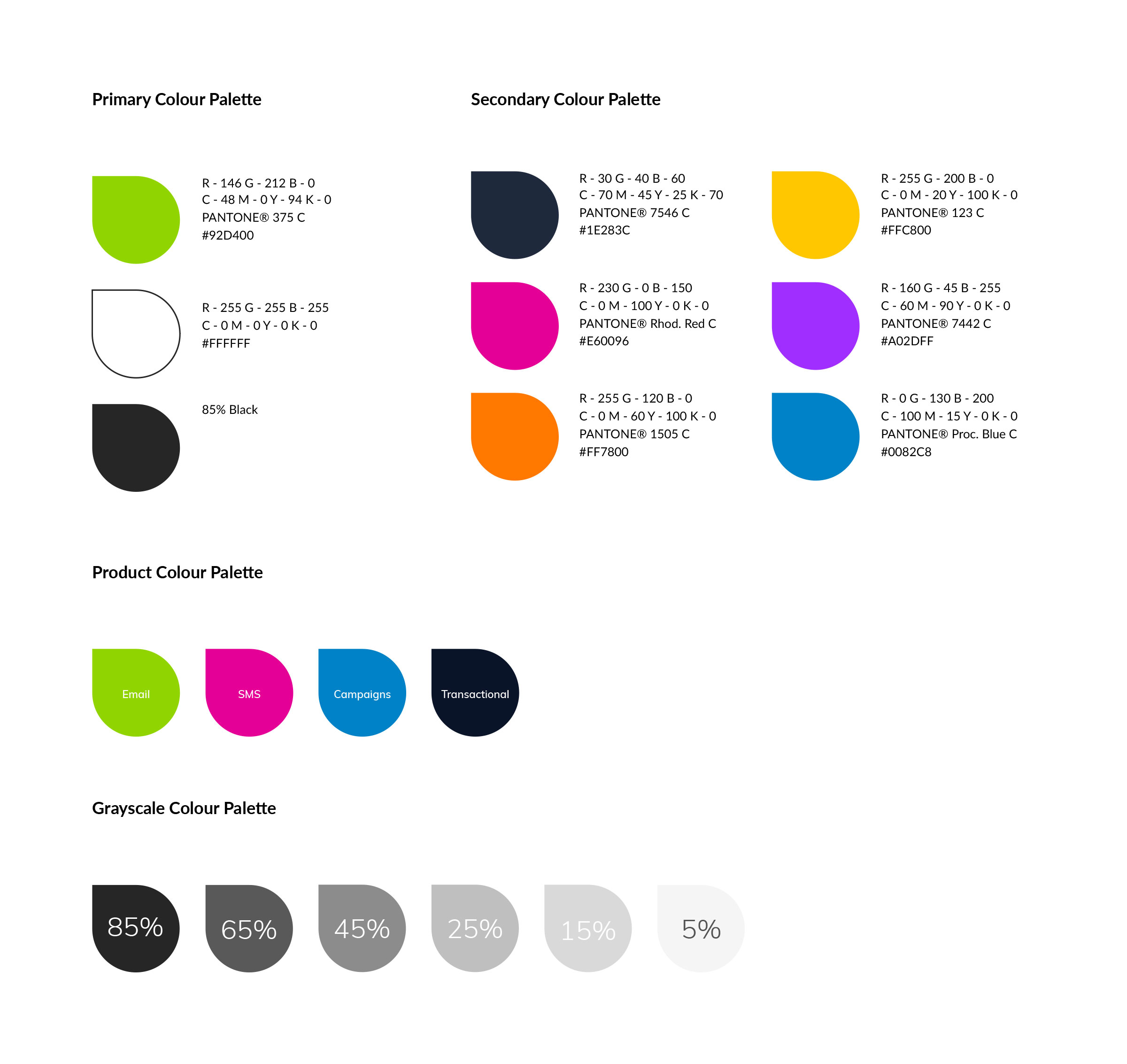
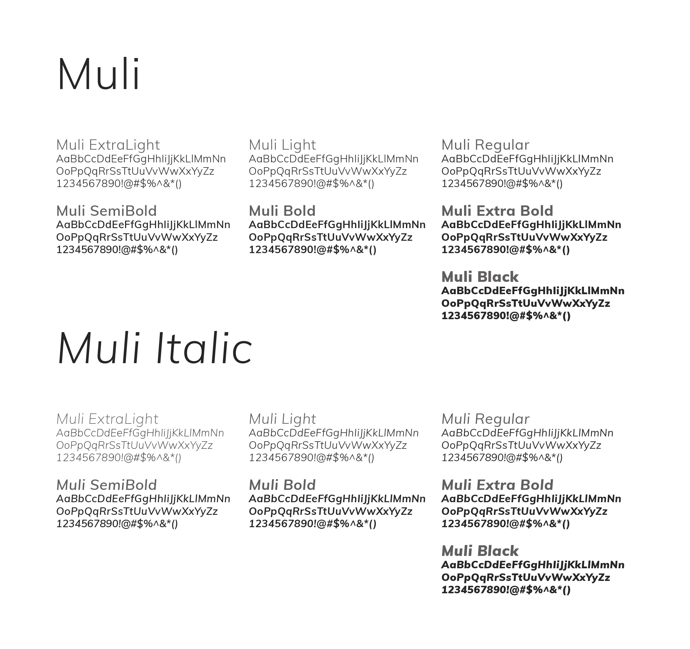
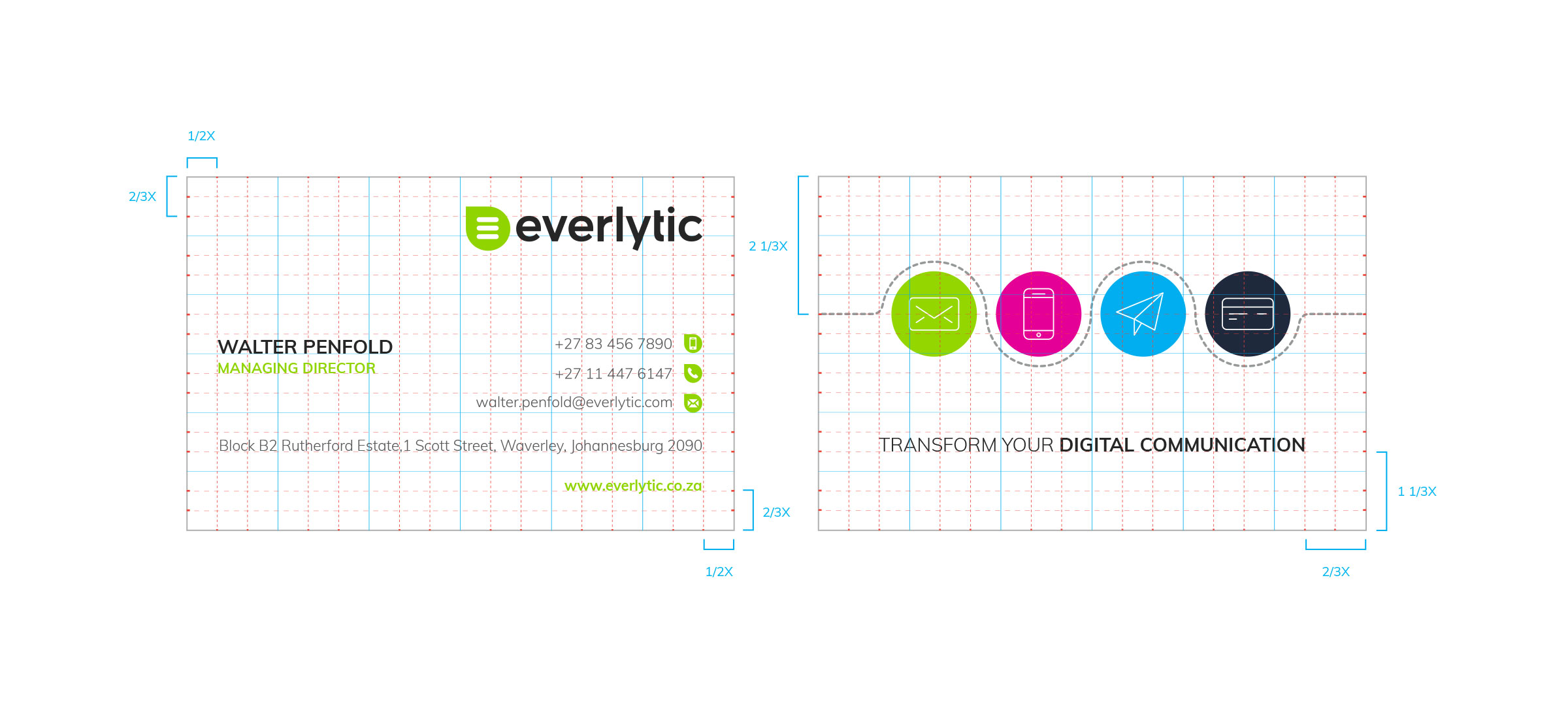
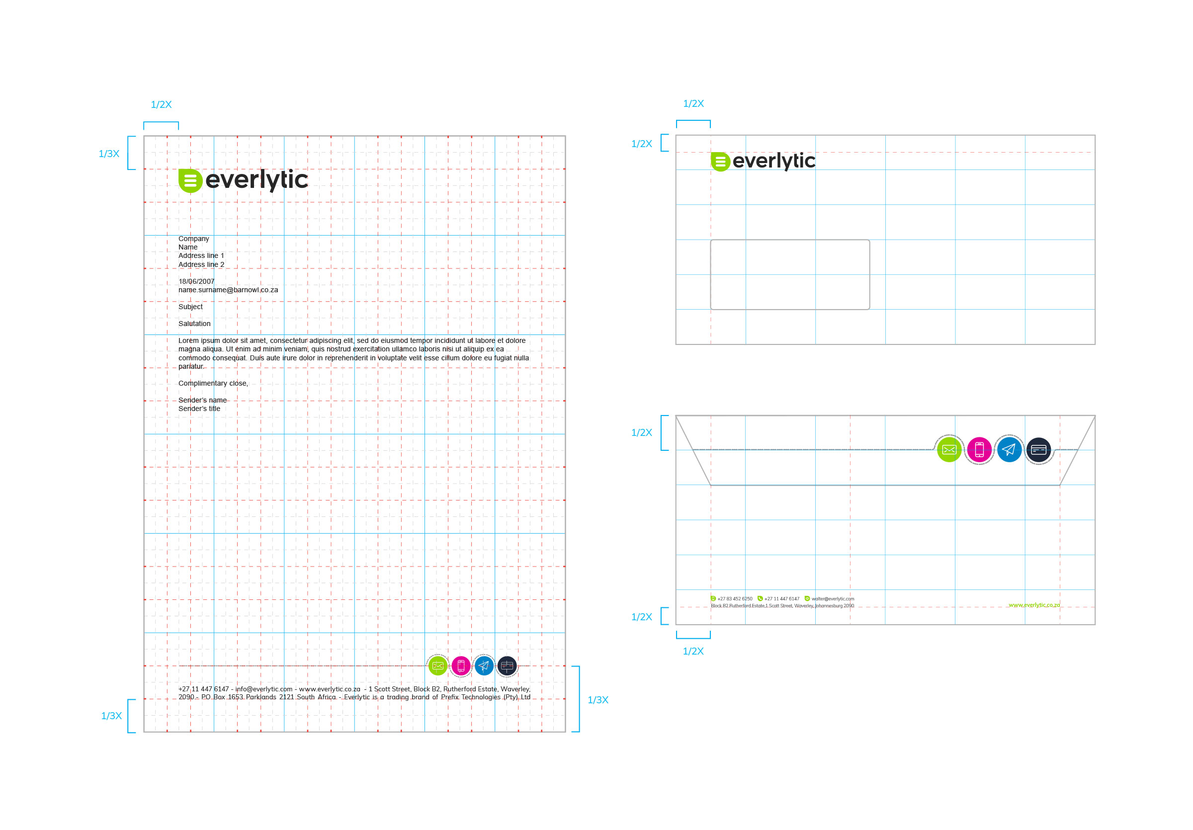
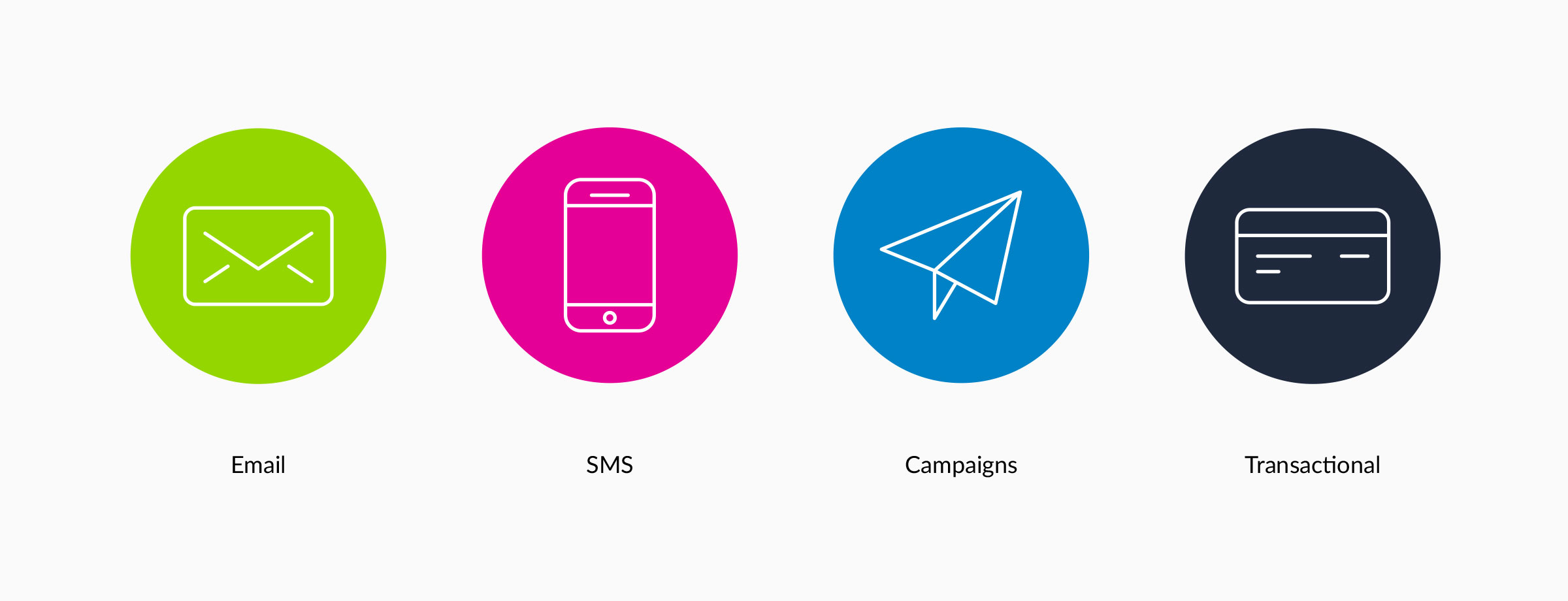
The system defined a structured colour architecture — a primary green and dark navy, plus secondary, tertiary, and product palettes (Email, SMS, Transactional) — Muli as the primary typeface for its clean, rounded, web-safe versatility, a grid system, iconography, and a full suite of stationery and collateral.
Art Direction
A photography and graphic language rooted in local authenticity.
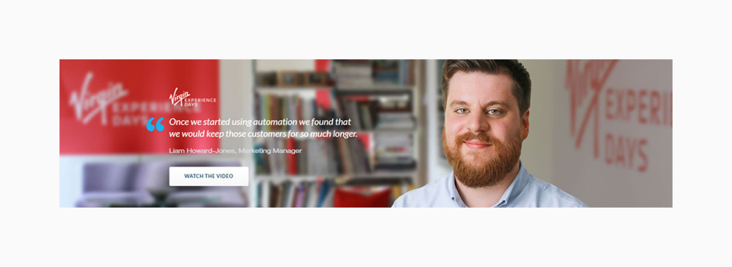
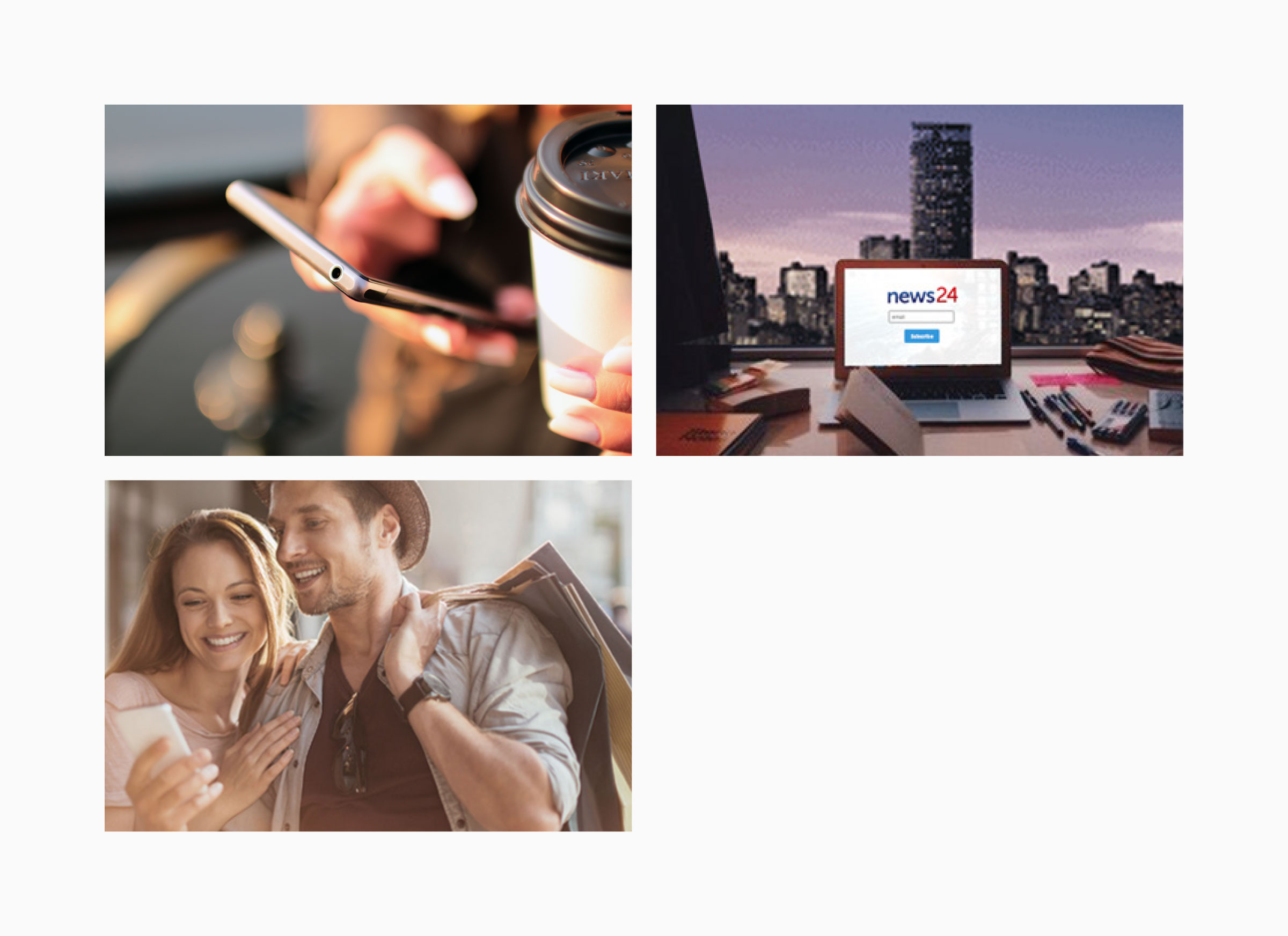
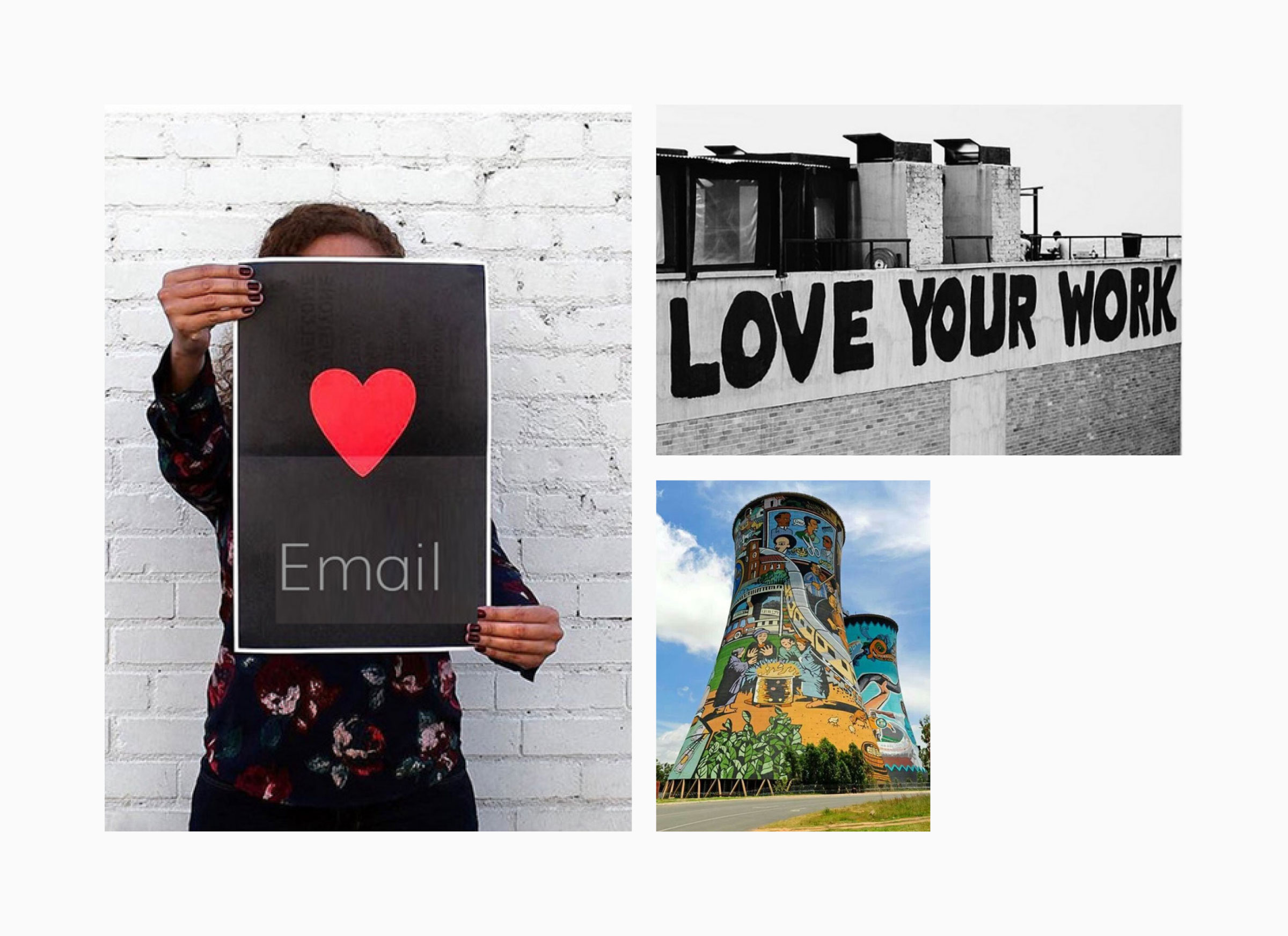
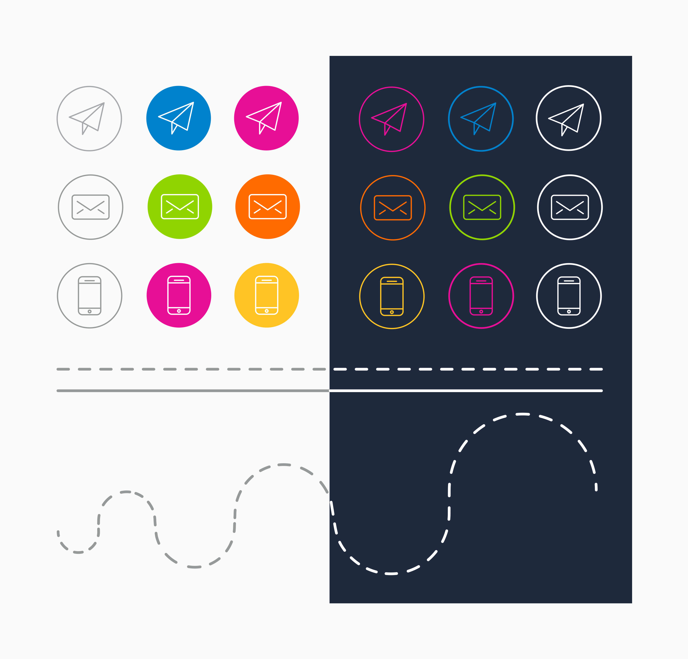
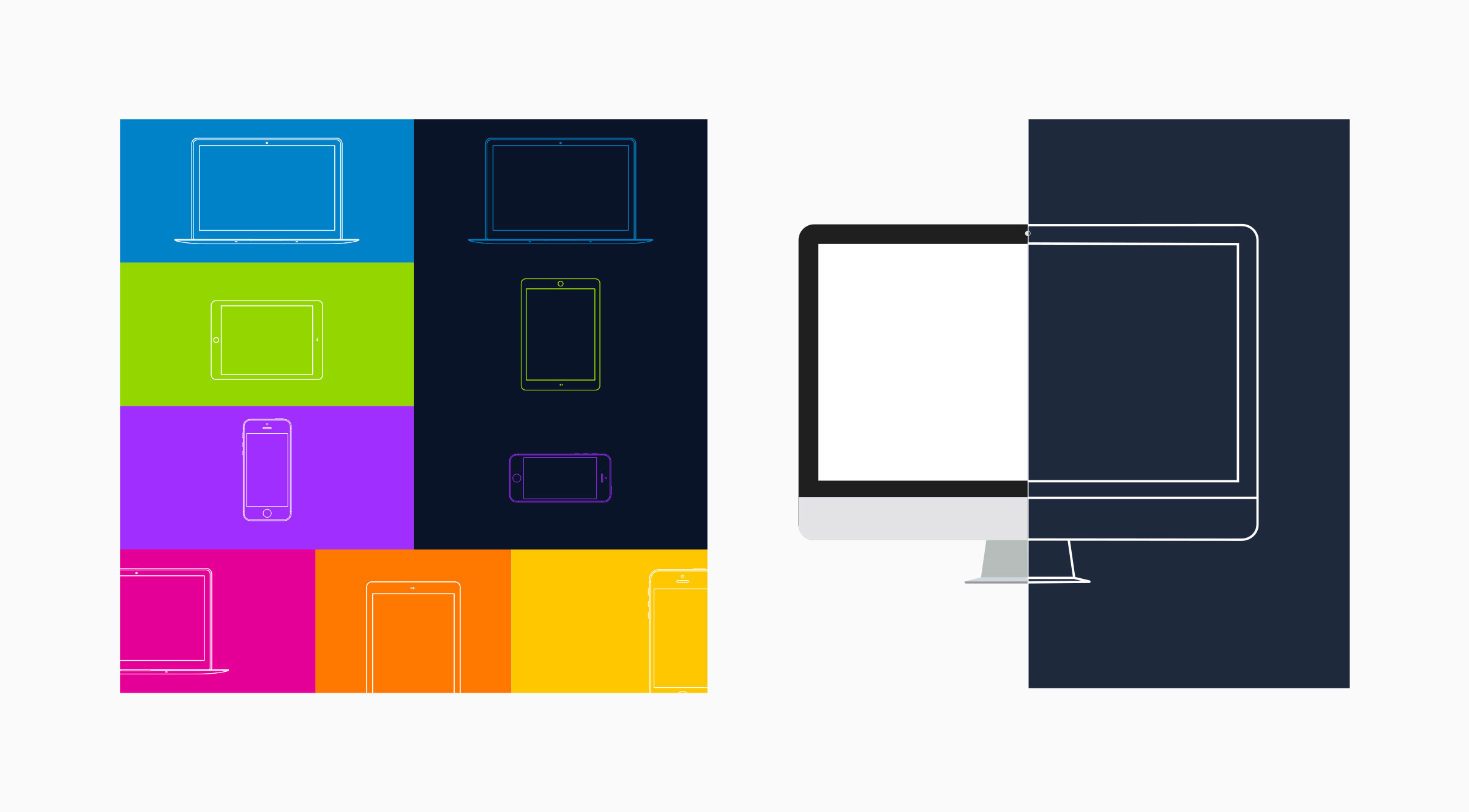
Beyond the logo, the system set a clear art direction: warm, authentic photography of real people and clients using the product — “no mug shots” — with local South African imagery as a “golden thread” tying the brand to its market. Product iconography and device illustrations extended the identity consistently across digital and print.
This gave every touchpoint — from the website to a business card to a campaign — a recognisable, cohesive feel.


Outcome
A cohesive brand foundation that still shapes Everlytic today.
The 2017 corporate identity turned a fragmented brand into a scalable, recognisable system — giving Everlytic a professional, consistent presence across product, web, and print, and a foundation the business could grow into.
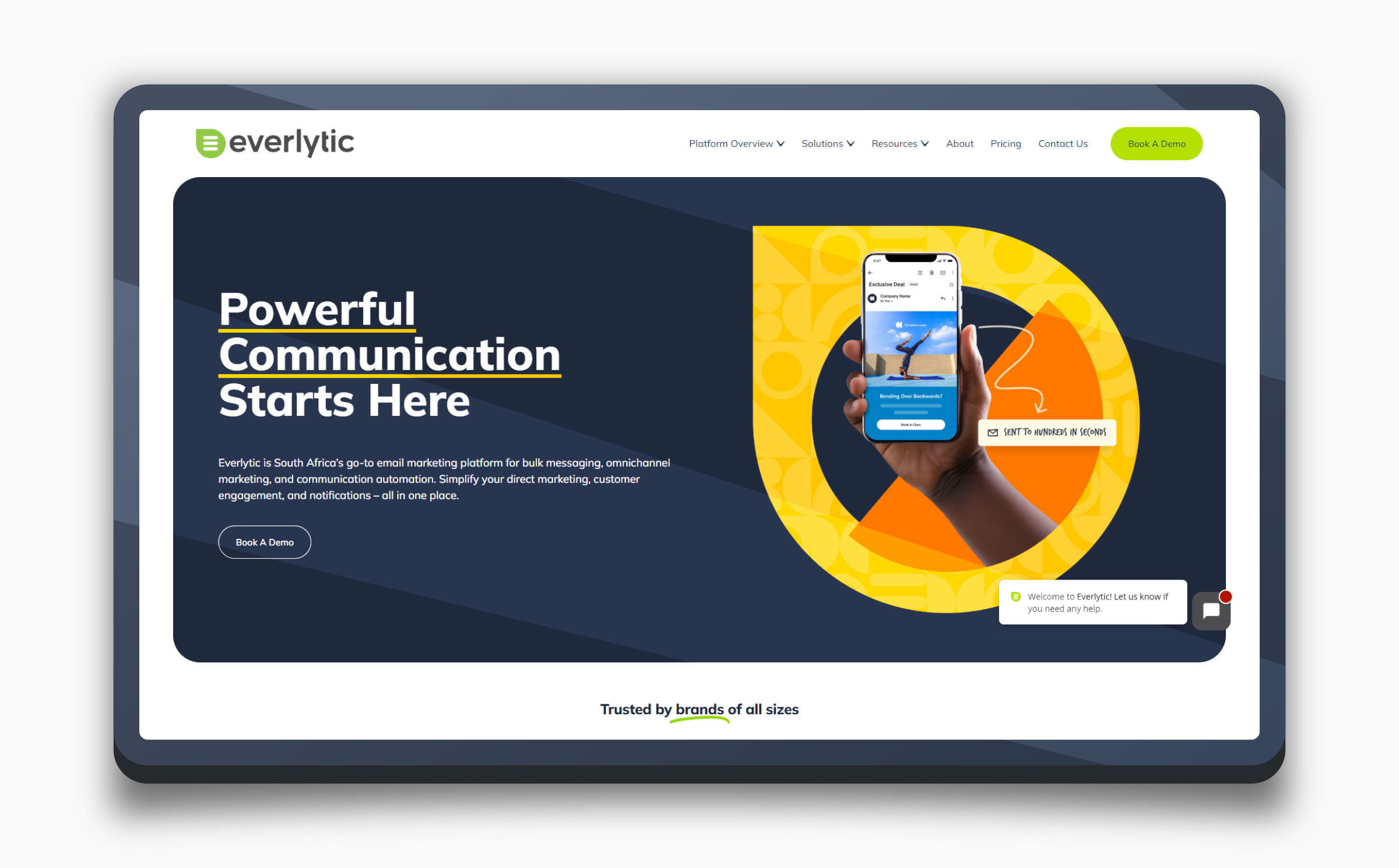
Its DNA endures: today’s Everlytic — now a leading omnichannel communication platform — still carries the green identity and structured brand language established in this redesign.