VOX · DESIGNED 2018–19 · LAUNCHED 2023
Frogfoot Networks Website Redesign
Overview
Turning an information-led fibre website into an intuitive, user-centric experience.
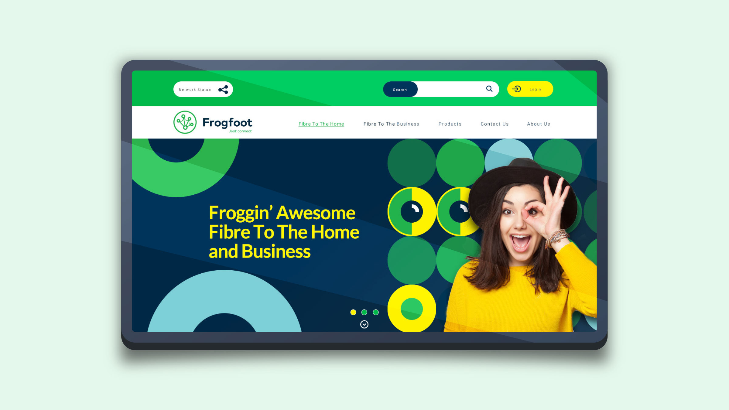
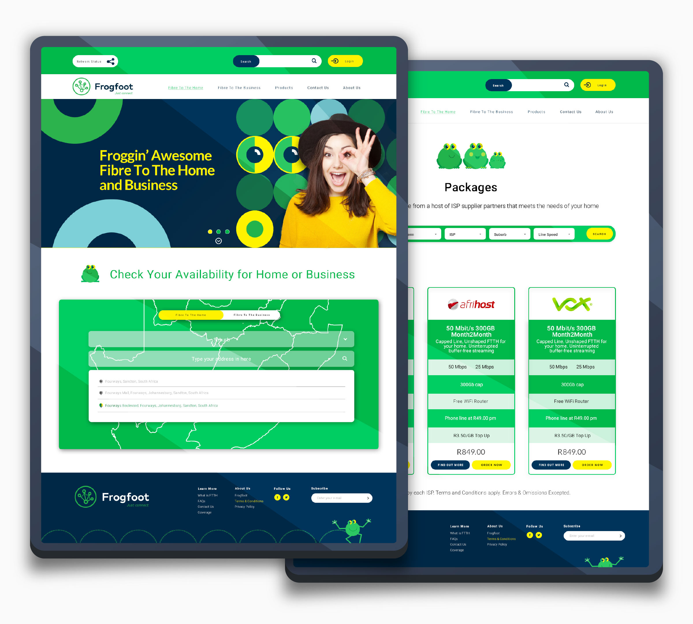
Working with the Vox marketing team and key stakeholders, I led the redesign of the Frogfoot Networks website — transforming a dense, information-led platform into a clearer, more intuitive digital experience.
The redesign simplified complex service messaging, streamlined user journeys, and improved clarity, navigation, and engagement across devices — establishing a scalable foundation aligned to Frogfoot's broader digital transformation strategy.
I also drove the research and planning (information architecture, persona mapping, user-journey flows and prototyping) and personally designed all wireframes and UI across every page.
Designed during my time at Vox; the redesign launched publicly in 2023.

- Role
- Senior UX/UI Designer
- Timeline
- Designed 2018–19 · Launched 2023
- Team
- Vox Marketing Stakeholders UX/UI Design
- Skills
- UX Strategy Information Architecture User Journeys UI Design Responsive Design Wireframing Prototyping Brand Evolution
About Frogfoot
An open-access fibre network operator serving homes and businesses.
Founded in 2000, Frogfoot Networks began as a South African telecommunications business providing internet services to small and medium enterprises. As demand for high-speed connectivity grew, the company shifted from retail services toward large-scale fibre infrastructure.
Following the sale of its consumer ISP operations and its acquisition by Vox Telecom in 2015, Frogfoot was repositioned as a dedicated open-access fibre network operator — delivering fibre-to-the-home and fibre-to-the-business infrastructure across metropolitan and regional areas, and enabling multiple service providers to compete over its network.
The Challenge
A service-explanation website that couldn't support a modern user journey.
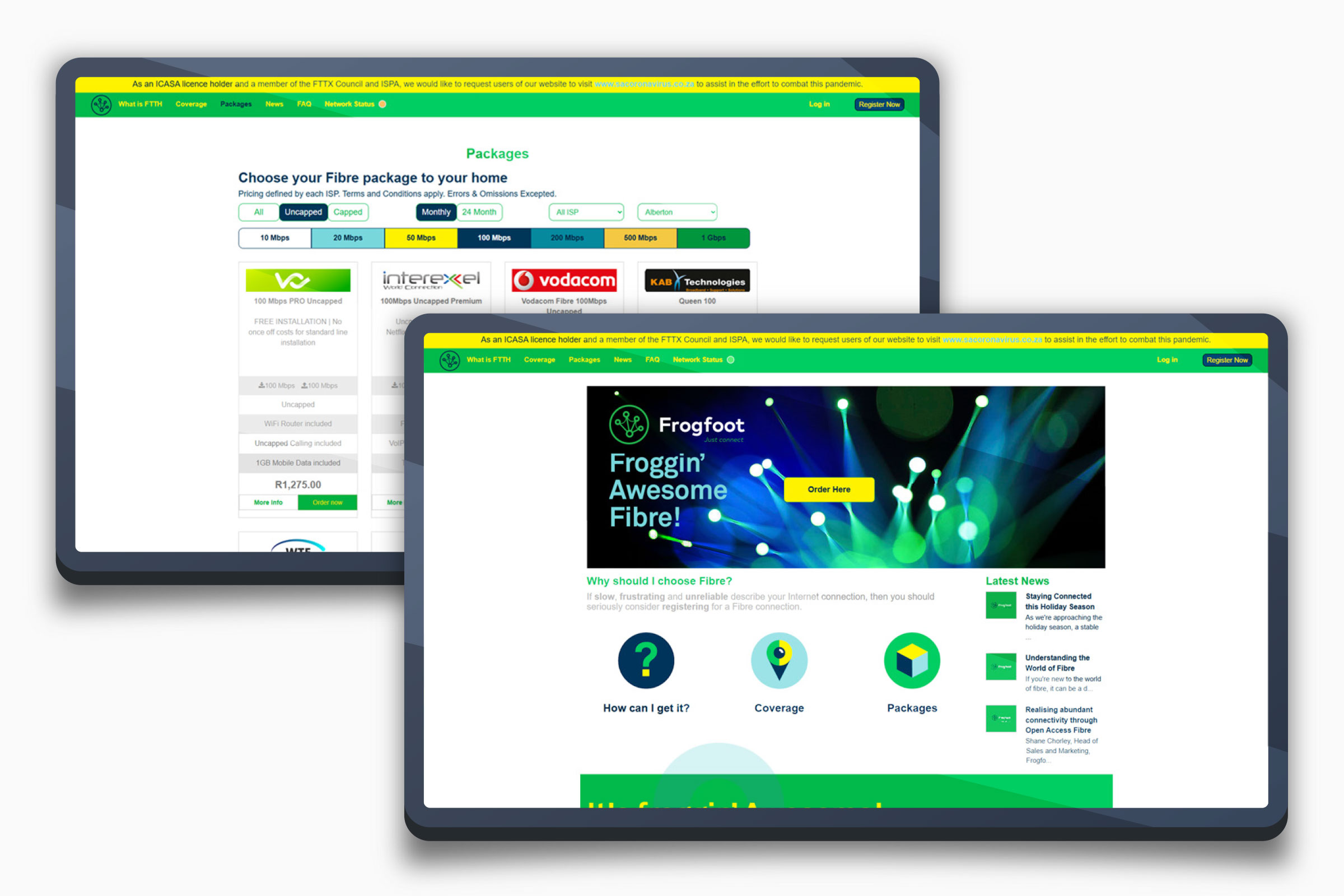
Prior to the redesign, the Frogfoot website was geared toward service explanation and operational enablement, reflecting the organisation's role as an open-access fibre provider. It delivered essential information — product overviews, coverage details, network status, and regulatory content — but was not structured for a modern, user-centric journey.
As the business scaled and served an increasingly diverse audience, the limits of an information-led website became clear: it needed to become a more intuitive, scalable platform that could better support engagement, clarity, and future digital growth.
The Approach
Simplifying complex messaging and streamlining the journeys that matter.
The redesign focused on reducing complexity: clarifying service messaging so visitors could quickly understand fibre-to-the-home versus fibre-to-the-business, streamlining key journeys such as coverage checks and sign-ups, and improving navigation and consistency across devices.
A modernised visual system retained Frogfoot's core brand equity while improving hierarchy and clarity — a strategic brand evolution rather than a reinvention.
The redesign collapsed a wandering, information-led path into a direct route to coverage and sign-up
The Result
A modernised, scalable brand experience that performs across platforms.
The revamp was delivered as a strategic brand evolution — retaining core brand equity while modernising the visual system, improving consistency, and creating a scalable identity designed to perform across digital and customer-facing platforms.
- ✓Simplified, clearer service messaging
- ✓Streamlined user journeys across devices
- ✓Improved navigation and visual consistency
- ✓A scalable foundation for future digital growth
Outcome
An information-led platform reshaped into a clearer, user-centric journey.
The Frogfoot redesign moved the organisation from a service-explanation website toward an intuitive, engagement-focused experience — clarifying complex fibre offerings, simplifying journeys, and giving the brand a scalable digital foundation aligned to its broader transformation strategy.