FM:SYSTEMS · CONCEPT 2022
FMS:Now UI Update & Dark Mode Theme
Overview
Bringing a core mobile app in line with the brand — and making it usable in any light.
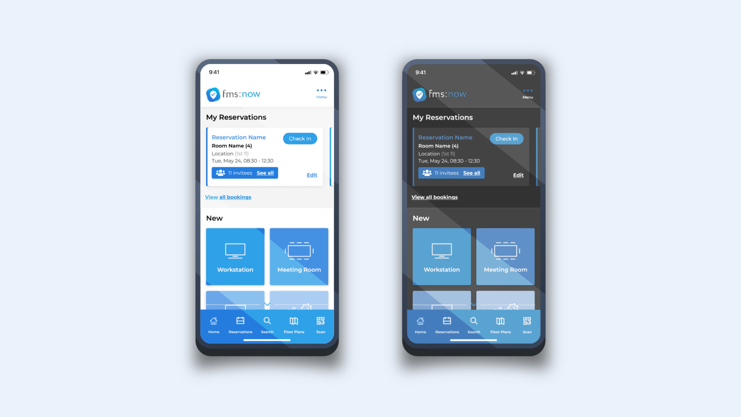
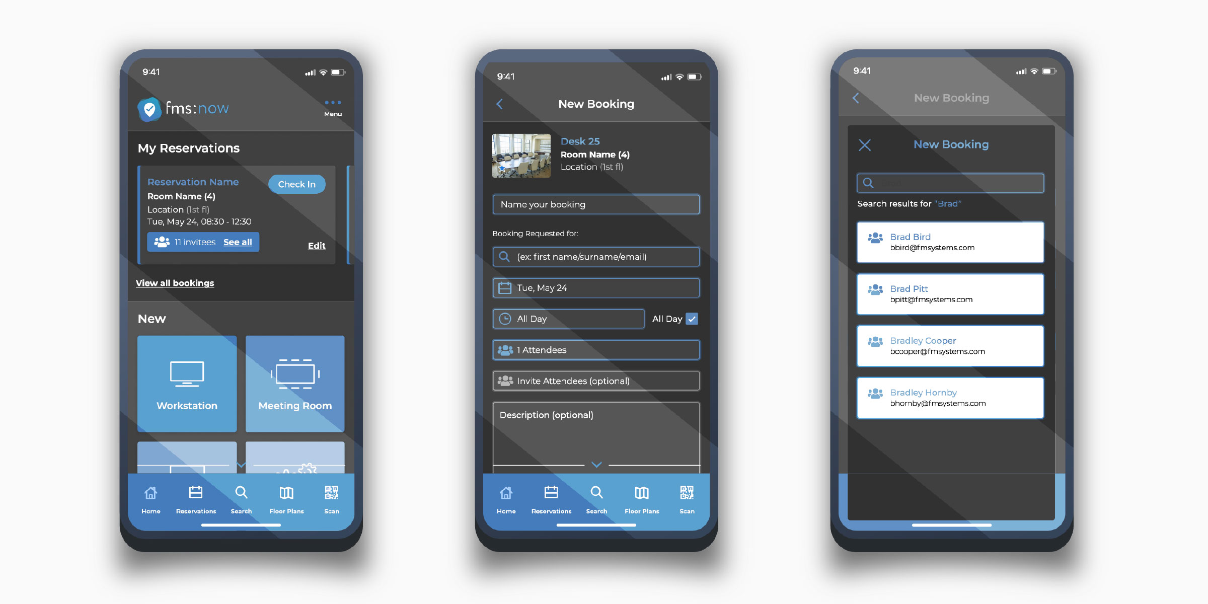
At FM:Systems I refreshed the FMS:Now mobile UI to match the corporate identity and Design System, then designed a comprehensive Dark Mode experience to elevate usability and accessibility. It established visual continuity across the product suite, strengthened WCAG readiness, and reduced eye strain in low light.
The Dark Mode theme won Most Impactful at the 2022 FM:Systems Hackathon.
- Role
- Senior UX/UI Designer
- Timeline
- 2022
- Team
- Product Management Engineering UX/UI Design
- Skills
- UI Modernisation Design System Implementation Accessibility (WCAG) Dark Mode / Theming Mobile UX Interaction Design Visual Design Prototyping
The Product
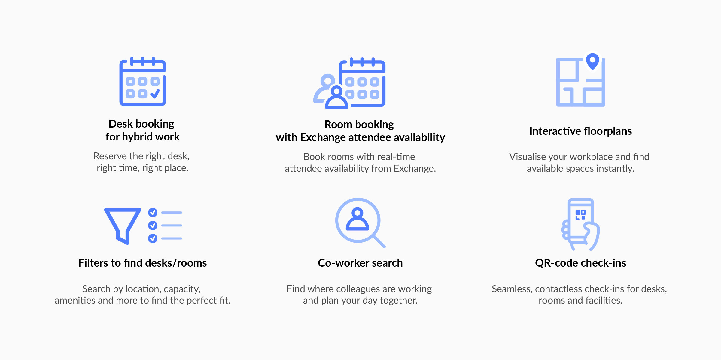
FMS:Now is a mobile-first desk and room-booking app for hybrid workplaces.
Part of FM:Systems' (now Johnson Controls OpenBlue) workplace management suite — quick reservations, floorplan-based booking, co-worker visibility, and Microsoft Exchange integration.
- ✓Desk booking for hybrid work
- ✓Room booking with Exchange attendee availability
- ✓Interactive floorplans
- ✓Filters to find desks/rooms
- ✓Co-worker search
- ✓QR-code check-ins
The Problem
An outdated interface that put trust, growth, and daily usability at risk.
FMS:Now suffered from an outdated interface, inconsistent visual design across the suite, and poor WCAG compliance — risking user trust, business growth, and long-term viability, adding friction from first impression to daily use.
Three compounding problems that eroded trust and usability
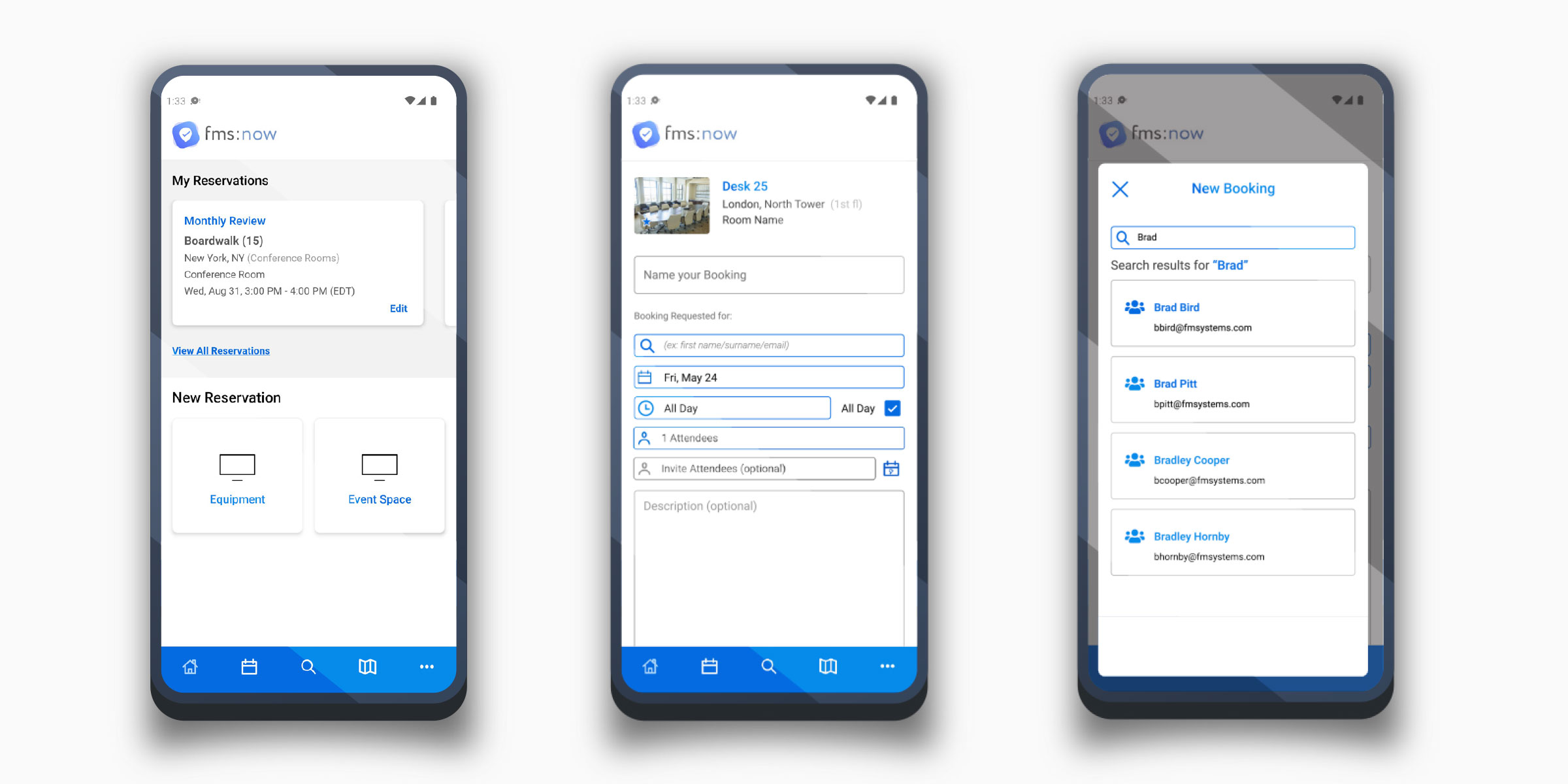
UI & Accessibility Audit
Grounding the redesign in evidence — the legacy UI, examined.
Before redesigning, I audited the legacy screens against the Design System and WCAG, mapping where colour, type, spacing, and contrast drifted.
The Solution
A comprehensive UI modernisation, built on the Design System.
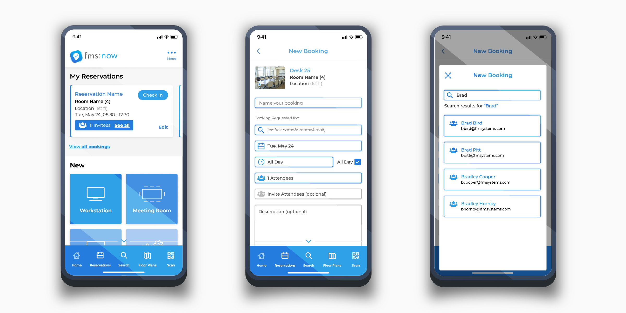
I led the modernisation end to end — rebuilding screens on the FM:Systems Design System for consistent components, colour, and type, and folding accessibility into the foundations.
The Result
Visual continuity across the suite, with accessibility built in.
The interface reflected FM:Systems' corporate identity and Design System, establishing continuity across the suite and improving usability; accessibility was integrated to strengthen readability, interaction clarity, and compliance readiness.
- ✓Consistent components across the suite
- ✓Stronger colour-contrast and readability
- ✓Clearer interaction and touch targets
- ✓A foundation ready to scale to Dark Mode
Dark Mode
A full Dark Mode theme — the award-winning capstone.
I designed and delivered a complete Dark Mode experience for visual ergonomics and low-light use, built on the same tokenised foundation, preserving brand recognition while re-tuning surfaces, elevation, and contrast. It won Most Impactful at the 2022 FM:Systems Hackathon and reinforced a unified, scalable design foundation for the wider ecosystem.
Dark Mode Surface Ramp
Light tokens mapped to a dark surface & elevation system
Outcome
A modernised, accessible, award-winning foundation for the wider ecosystem.
The refresh brought a core mobile product into line with the brand, made it usable in any lighting, and demonstrated an accessibility-first, systemised approach — recognised internally with the Hackathon's Most Impactful award.